

Facebook’s app is looking a lot different and, surprise surprise, not everyone is a fan.
The company showed off the redesign back in August, when it introduced its latest News Feed updates. But the revamped mobile app is still gradually rolling out to everyone, so many people are just starting to see it.
Predictably, as with most major Facebook updates, there’s been a strong reaction even though the update isn’t finished rolling out yet.
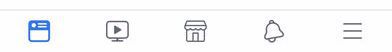
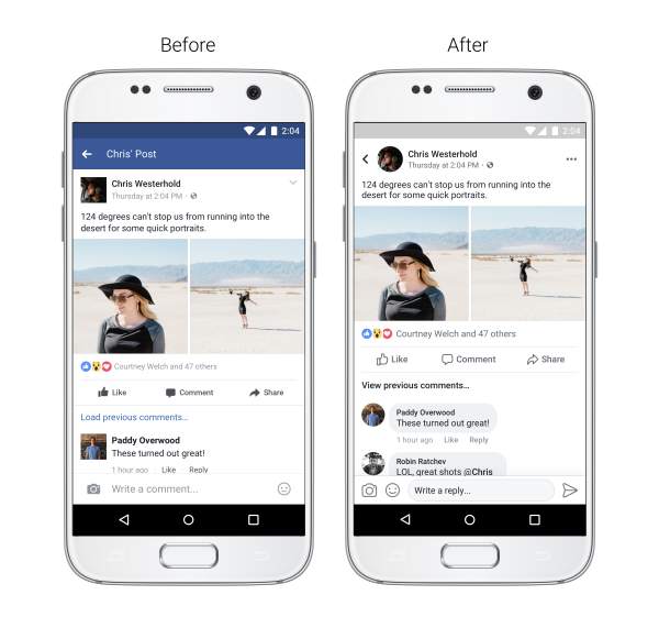
The app is now really gray, and looks much flatter, with comments looking more like chat messages than a threaded conversation.
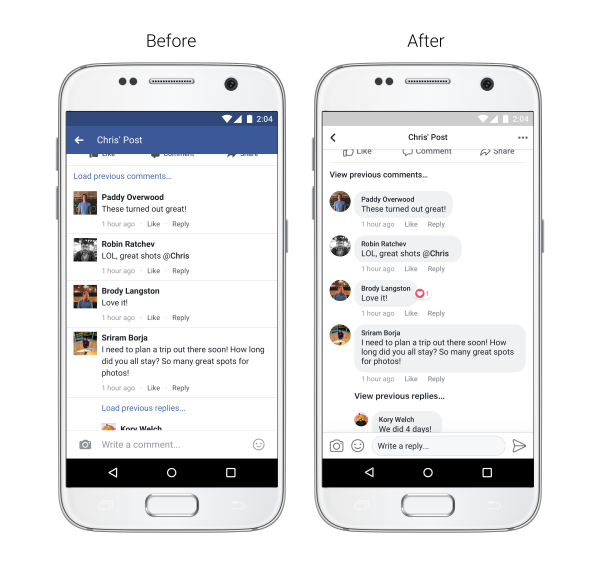
Facebook says the update is meant to make News Feed “easier to navigate,” but not everyone is convinced. While a significant redesign can always be a bit jarring the first few times you see it, many are calling the new look, with its redesigned icons and rounded corners, “cartoonish.”
But Facebook’s reasoning holds more weight than you may think, explains Kori Handy, VP of Design at Shyft.
“The grey ‘dull’ colors are on purpose, Because of its neutrality, it is frequently used as a background color. It makes other colors pop,” he says.
And those round “cartoonish” avatars? It’s more simple than you might think, according to Handy, who previously lead design teams at Microsoft and PayPal.
“Why make an avatar image round? Well your face is more round than a box, right? Also, from a visual design perspective, the content is boxed, and if the avatars are boxed too, it makes the user have to divide content from people’s faces.”
Though Facebook users may be particularly sensitive to these types of changes, the social network is far from the only company retooling its look. As we pointed out when the update first released, Twitter also redesigned its app to feature round avatars and new fonts.
In Handy’s view, both companies have drawn inspiration for their new look from what may seem like an unlikely source: Instagram. It’s easy to forget now, but in May 2016 the company rolled out a major redesign. That revamp brought users a cleaner, flatter look complete with more subtle navigational icons and a minimalist black and white design.
“Both Facebook and Twitter have been influenced by Instagram’s past design changes,” Handy says. “This new design thinking is basically the next ‘safe’ design, when 1-2 yrs ago it was a risky design.”
Though Instagram’s update was controversial at the time, it’s difficult now to imagine anyone wanting to go back to the previous look, which actually felt closer to a cartoon than Facebook’s current app.
So while some people are likely continue complaining about Facebook’s latest makeover for some time, the bulk of users could adapt to the new look faster than you’d think.